NC State University Responsive Redesign
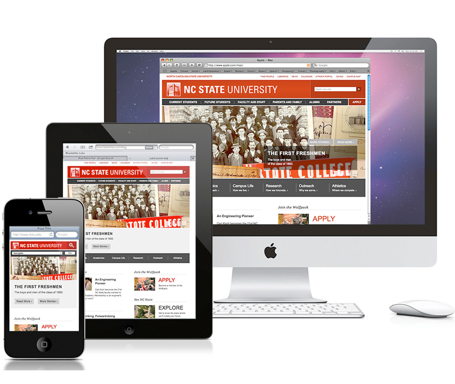
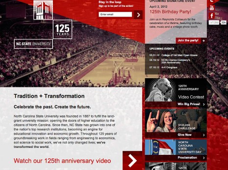
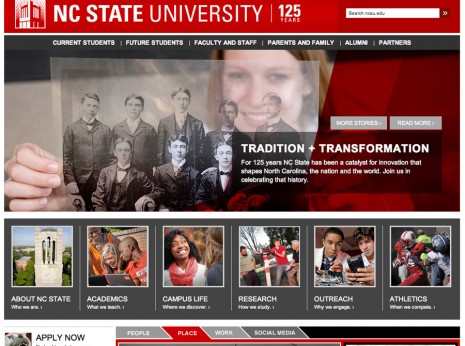
The 2012 celebration of NC State’s 125th anniversary generated a wave of enthusiasm on campus and online for the university. As the party drew to a close in early 2013, we unveiled a redesign of ncsu.edu. Our goal in redesigning was to carry that enthusiasm forward and guide it toward utilities and content with strategic value for the university. At the same time, we saw a trend developing in our analytics: rapid growth in mobile traffic to the NC State homepage and core site. Guided by our communication goals and our analytical research, we aimed to build a more actionable, responsive (mobile-friendly) homepage and central site.
By late 2012, when we began planning for our 2013 redesign, mobile traffic to ncsu.edu was on a steady ascent. Mobile users accounted for 3 percent of our site traffic in August 2011. A year later, nearly 6.5 percent of ncsu.edu visitors arrived via mobile devices. We weren’t moved solely by the number of mobile users. It’s also the sort of audience that represents: first-adopter types among our high-achieving student body and business-minded users who could become NC State partners. We wanted to get ahead of the curve in making sure ncsu.edu offered an equally seamless, engaging experience on mobile phones, tablets, laptops, desktops and elsewhere.
Awards
- CASE III Grand Award: Total Website Design and Organization


