NC State Branding Redesign
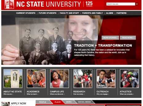
The new NCSU.EDU is a sleeker, more purposeful web presence that executes and radiates the NC State brand. It showcases our new voice and tone, typography, dynamic color palette, imagery and cutting-edge web development. The new site launches NC State’s innovative approach to digital content strategy, using the brand platform and strategic plan as our foundation.
The new site also builds on the 2012 redesign and keeps us ahead of digital trends. We built it with a mobile-first philosophy, ensuring that the site is impactful and useful to users on mobile devices. Research shows that the next wave of students will be the first “mobile only” generation.
Built into this redesign was a comprehensive review of all core-site content. We drastically reduced the number of pages on the core site, cutting away outdated or unuseful content. We kept what was useful, reframing content to fit the new brand and organizing it in a more purposeful, user-friendly way.
Another of our goals was to put the user first, making our content and navigation as clear, accessible and relevant as possible. Our streamlined topical landing pages and audience sections broadcast the new NC State brand and assist our fans in discovering NC State’s impact.


